Friday 28 April 2017

Final Animation


Blocking Pass

I was given feedback that the animation was too fast and needs more anticipation, as well as more weight to the characters. The opening music faded out too abruptly, and I was advised to make it stop with the door being slammed open. I was also advised to extend the leaflet scene and/or change the text so the viewer has more time to read  it. The shot when the postman opens the box needed more weighting and timing and expressions.
I have also been advised to change the parcel to make it obvious that it is fragile, although I am unsure if this is possible without adding in an extra shot or closeup of the parcel.
Finally I have been told that the ending would be more effective if the car was audible before it came into the shot.
This feedback will be addressed in my final animation.

Final Animatic


Wednesday 8 February 2017

Animatic: In Progress


Storyboard: In Progress

Updated Intro Sequence: I have added the close up of the Postman avoiding the car to help break up the scene due to feedback that the establishing shot was too long.

Title Sequence: I was quite proud of my concept for the title sequence as I found it to be quite dynamic. Before the Postman runs through the shot "Post" fades in. and as he runs through "Haste" Wipes behind him as if it was a speed trail behind him.

Antagonist Introduction: I was quite pleased with how I planned out the lighting for this shot, although the character interaction and movement was lacking, so this shot was improvised more when it came to 3D.

"Parcel Grab Scene", as it's effectively called in my Maya folders, was one of my most dreaded scenes to work with in 3D, as I did not thoroughly plan out the layout of the inside of the building. This led to a relatively empty room when created in 3D.

The stairs sequence: This quick shot of the two running up the stairs was a replacement for a far longer more drawn out sequence of them doing parkour and climbing up a fire escape, although i was advised because I had no reference for it as well as it being too long for a single shot that I should limit it to a simpler shot. I'm glad I did. 

The Parkour Sequence: This was the most exciting part of the storyboarding process for me, as I wanted to convey a tense action sequence and experimented with camera angles and camera angles more, which resulted in quite a dynamic sequence.

They jump off of a building: In the past, during storyboarding I wasn't particularly eager to use arrows to indicate direction of movement. I did throughout my storyboarding process this time and it was incredibly useful as it helped me recreate the movements in 3D with far greater accuracy.

More Parkour and Arrows: Continueing to experiment with camera angles, I believe this shot was quite interesting, although I didn't consider what the Postman would be jumping over until I reached 3D, which led to a problem translating it. I finally decided to have the Postman jump over a car instead of an ambiguous grey block.

The final sequence: Inspired by westerns, I wanted to have the final showdown work well with the timing of the soundtrack I had created. I also wanted the car from the beginning to have another appearance, bringing the animation to a close.

Finally I ended the animation with the postman celebrating his success, only to have it all fall apart. The end.

3D Modelling: Environment

Original Low Poly Buildings
Attempt One at building a Town: Buildings were too similar, and not colourful enough.
Attempt Two: The Buildings have more variety but the number of trees made it look strange.
Attempt Three: Removed Trees, Added variety to the roads by raising and lowering parts and added hills in the background, which were too big and somewhat distracting.
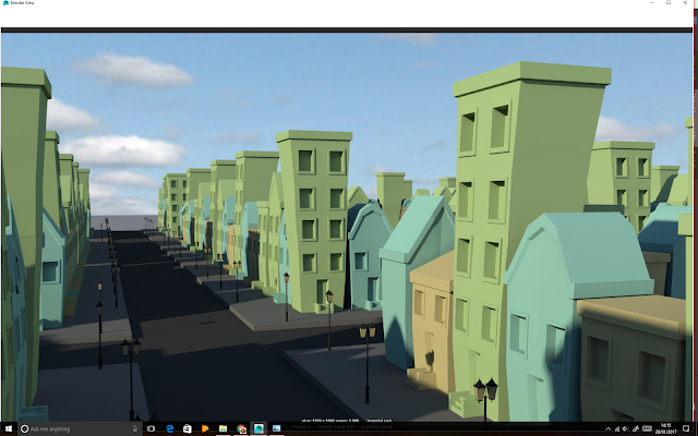
Final Attempt: Using Instances instead of Duplicates decreased file size and render time dramatically, also smaller hills in the background look nicer. Added trees again but far less dense than attempt two. Also added low poly cars and props to bring the streets to life a little.
The Low Poly Car in Smooth Mesh Preview with an old character model from a previous project.

3D Modelling: Characters

ZBrush Head Sculpt: Created in Zbrush, this head sculpt served as a start to the model and helped me visualise the character quicker in 3D. I then retopologised it in Maya and began building the body. 
Modelling the body: Modelled in Maya, I created the body using the reference images I had created. I retopologised the head using the quad draw tool in Maya.
Modelling the robot: I modelled the robot using hard edge modelling techniques and polygon primitives to create the individual sections of the body. These parts remained separate to help give the character a more robotic movement when animated. Instead of modelling the robot directly from the reference images in Maya, I instead placed the Postman into the scene and turned him into a template, allowing me to create my robot in the exact same proportions. This also allowed me to reuse the exact same skeleton I had set up for the postman to rig the robot.


Textures: Top is Post Bot, Bottom is Postman


Final 3D Models


Postman Turnaround


Post Bot Turnaround

After receiving feedback on how the two characters were too similar, I changed the Post Bot's textures to give him a more robotic appearance.